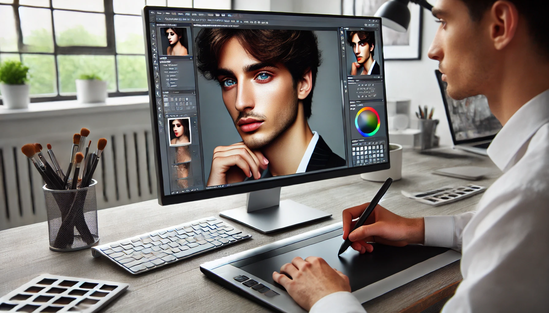
In the world of portrait photography, retouching is an essential skill that can elevate an image from good to truly spectacular. Whether you’re a photographer looking to enhance your own work or someone looking to perfect their portraits, understanding the art of retouching is crucial. Professional-looking retouching can transform a simple photo into a polished masterpiece, making your subject look their best while still maintaining a natural feel.
While many people think of retouching as merely fixing flaws—like blemishes or wrinkles—there’s much more to it than that. True portrait retouching is about enhancing the subject’s natural beauty, bringing out their best features without overdoing it. The goal is to create an image that feels authentic yet refined, ensuring that the person in the portrait still looks like themselves, only with a bit of added glow. In this article, we’ll dive into the techniques that pros use to achieve stunning, natural-looking retouches.
Understanding Portrait Retouching Basics
Portrait retouching is the art of enhancing and refining a photograph to create a polished, professional-looking image while maintaining the subject’s natural beauty. It involves a variety of techniques to improve the appearance of the person in the photo, such as smoothing skin, brightening eyes, removing imperfections, and adjusting lighting or color. However, portrait retouching isn’t just about erasing flaws—it’s about bringing out the best features of the subject in a way that feels authentic and visually appealing.
Key Differences Between Basic and Professional Retouching
When it comes to portrait retouching, there’s a clear distinction between basic edits and professional-level work:
- Basic Retouching typically involves simple edits, such as removing blemishes or adjusting contrast and brightness. While these edits can improve the image, they often lack the refinement and depth that professional retouching provides.
- Professional Retouching, on the other hand, requires a more advanced skill set and an understanding of how to subtly enhance each element of the photo. It involves techniques like frequency separation (for skin texture), dodging and burning (to enhance highlights and shadows), and advanced color grading (to give the image mood and warmth). The goal is to create a natural, but flawless, look that feels realistic yet stunning. Professionals also ensure the image is optimized for various platforms, whether for print or online use.
Tools and Software Used by Professionals
To achieve professional-level portrait retouching, photographers and retouchers rely on powerful tools and software. The most commonly used programs include:
- Adobe Photoshop: Known as the industry standard for image editing, Photoshop offers a wide range of tools for advanced retouching. Features like the Healing Brush, Clone Stamp, and Content-Aware Fill allow for precise edits. More complex techniques, like frequency separation and dodging and burning, can be done seamlessly in Photoshop.
- Adobe Lightroom: While Lightroom is often used for general photo adjustments, it is also a valuable tool for portrait retouching. With its easy-to-use sliders, Lightroom can adjust exposure, white balance, and contrast, and it offers powerful tools for enhancing details like the eyes and skin. Lightroom is especially useful for batch processing multiple images or making global adjustments to a series of photos.
- Capture One: Another popular choice among professionals, Capture One provides advanced color grading and tethered shooting capabilities. It’s often favored by studio photographers for its superior color accuracy and raw processing power.
These tools are essential in the professional retoucher’s toolkit, offering the flexibility and precision needed to create stunning portraits that stand out.
By understanding the basics of portrait retouching and the tools that professionals use, you’ll be well on your way to mastering the art of retouching and creating images that truly shine.
Preparation: Organizing Your Workflow
Before diving into retouching portraits, proper preparation is key to ensuring the best results. A well-organized workflow not only saves time but also helps maintain high-quality output throughout the process. Here are the essential steps to prepare your workspace and set up for a successful retouching session.
Importance of Working on High-Resolution Images
The first step in portrait retouching is ensuring you’re working with high-resolution images. High-resolution files contain more detail and allow for finer adjustments during editing. When working on low-resolution images, you may notice pixelation or blurriness after making adjustments like skin smoothing or sharpening, which can result in a less polished look.
Always shoot or choose portraits in the highest resolution possible. Ideally, images should be taken at 300 DPI (dots per inch), especially if they will be printed. This ensures every detail is captured and gives you more flexibility when making edits.
How to Prepare Your Workspace
Once you’ve selected your high-resolution image, it’s time to set up your workspace in a way that supports a smooth, efficient workflow. Here’s how to get organized:
- Organizing Layers: A clean layer organization system is crucial when retouching portraits. Layers allow you to make adjustments to specific elements of the image without affecting the entire photo. In Photoshop, for instance, use separate layers for skin retouching, hair adjustments, and color grading. This allows you to go back and tweak individual areas without affecting the others.
- Label your layers clearly, so you know exactly what each layer is for (e.g., “Skin Retouch,” “Eyes,” “Background”).
- Group related layers into folders, especially for complex projects with many edits.
- Duplicate the original image layer before starting, so you always have an untouched version to return to if needed.
- Using a Non-Destructive Workflow: Non-destructive editing is the practice of making changes without permanently altering the original image. This approach allows you to adjust, undo, or refine edits at any time.
- Use Adjustment Layers in Photoshop or Lightroom. These allow you to modify aspects like exposure, color, and contrast without affecting the image itself.
- Masks are another crucial tool. They let you apply changes selectively, meaning you can hide or reveal adjustments in specific areas.
- For skin retouching or texture work, consider using techniques like Frequency Separation or Cloning/Healing on Separate Layers to maintain the integrity of your image.
Setting Up Your Color Profile for Accuracy
Color accuracy is essential when retouching portraits, especially when you’re making skin tone adjustments or working on color grading. To ensure that the colors in your portrait are true to life and consistent across devices, it’s important to set up a color profile.
- Monitor Calibration: Before you start editing, calibrate your monitor to ensure that the colors you’re seeing on screen are accurate. Tools like a color calibration device can help you achieve this. If your monitor is uncalibrated, the colors you see while editing may not match the final output.
- Color Profile Settings: Photoshop and other editing software allow you to work with specific color profiles (e.g., sRGB, Adobe RGB, ProPhoto RGB). For most portraits intended for web use, sRGB is the standard, while Adobe RGB offers a wider color gamut and is ideal for high-quality prints. Set your color profile correctly within your software’s settings:
- Edit > Color Settings in Photoshop.
- Ensure you’re working in the correct color space for the output you desire (print or digital).
- Soft Proofing: If you’re preparing your portrait for print, consider using soft proofing. This allows you to simulate how the image will appear once printed, helping you adjust colors, brightness, and contrast accordingly before you finalize your edits.
By preparing your workspace with high-resolution images, organizing layers efficiently, using a non-destructive workflow, and ensuring color accuracy, you’ll set yourself up for a smoother and more professional retouching experience. These foundational steps not only help you maintain flexibility during editing but also guarantee that your final portrait retains the highest quality.
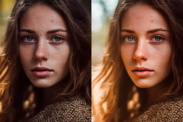
Skin Retouching: Smoothing and Enhancing
When it comes to portrait retouching, skin is often the focal point. A key goal is to enhance the skin without making it look unnaturally flawless. Here’s how you can remove blemishes and imperfections, smooth the skin while preserving its natural texture, and enhance the overall tone for a realistic, professional result.
How to Remove Blemishes, Acne, and Imperfections
The first step in skin retouching is to address any imperfections such as blemishes, acne, or uneven skin tone. While it’s tempting to go overboard with skin smoothing, it’s important to ensure the subject’s skin still looks authentic. Here’s how to approach this:
- Use the Healing Brush Tool (Photoshop) – The Healing Brush tool is perfect for quickly removing blemishes. It automatically samples surrounding areas and blends the imperfection into the skin, making it disappear seamlessly.
- Clone Stamp Tool – For more complex imperfections or larger areas, the Clone Stamp tool can be helpful. Make sure to sample from areas that are similar in texture and tone to avoid unnatural-looking results.
- Spot Healing – For minor blemishes, you can use the Spot Healing Brush tool for quick fixes. Just click on the blemish, and Photoshop will automatically remove it, blending it in with the surrounding skin.
When removing blemishes, keep the following in mind: aim for subtlety. It’s not about erasing every little imperfection but rather enhancing the overall skin appearance while maintaining its natural look.
Techniques for Smoothing Skin While Preserving Texture
One of the most challenging aspects of portrait retouching is creating smooth skin without losing the natural texture. A popular technique for this is frequency separation, which allows you to keep skin details intact while adjusting tone and smoothness. Here’s a step-by-step guide:
- Create a High-Frequency and Low-Frequency Layer:
- Duplicate the background layer twice. Name one “Low Frequency” and the other “High Frequency.”
- Apply a Gaussian Blur to the “Low Frequency” layer to blur the skin tones (this removes imperfections and color variations).
- On the “High Frequency” layer, apply a “High Pass” filter to retain the fine texture (this keeps pores and skin details intact).
- Separate the Frequencies:
- Use the Low Frequency layer to adjust the color and tone of the skin, using tools like the Healing Brush or Gaussian Blur to smooth out uneven areas.
- On the High Frequency layer, use the Clone Stamp Tool or Healing Brush to fix any small imperfections, but be sure not to smooth over the skin texture too much.
- Smoothing Without Overdoing It:
- When using the low-frequency layer, aim for evenness in tone, but don’t remove too much texture. The goal is to smooth out the color transitions and blemishes without making the skin look too artificial.
- For the high-frequency layer, make subtle adjustments to retain the skin’s natural detail and prevent the face from looking overly smoothed or plasticky.
Enhancing Skin Tone and Texture for a Natural Look
After removing imperfections and smoothing the skin, it’s time to enhance the skin tone and texture for a healthy, natural look. Here’s how to achieve that:
- Use Dodge and Burn:
- Dodge: Lighten areas of the skin where natural highlights would appear, such as the cheekbones, bridge of the nose, and forehead.
- Burn: Darken the shadows under the cheekbones, around the jawline, and near the temples to add depth and dimension to the face.
- Adjust Skin Tone with Selective Color Adjustments:
- Use Curves or Hue/Saturation adjustments to fine-tune the skin tone. If the skin looks too red or orange, you can reduce the saturation in those areas or shift the hue toward a more natural shade.
- Be careful not to overdo it. The goal is to enhance the subject’s natural tone, not to create an unnatural or overly uniform skin color.
- Use a Soft Light Layer to Add Warmth:
- Adding a soft light layer with a warm color can give the skin a healthy glow. Use a soft, warm color (like light yellow or orange) and paint softly over the skin, then adjust the opacity for a natural look.
Final Tips for Skin Retouching:
- Always zoom in to 100% while retouching to check for any inconsistencies.
- Take regular breaks to come back with fresh eyes, as it’s easy to overdo retouching when you’re working too long on the same image.
- Remember, less is often more—subtle, gradual changes will give your portraits a polished, professional look without sacrificing authenticity.
By following these techniques, you’ll be able to retouch skin like a pro, enhancing its natural beauty while maintaining the texture and tone that make portraits look real and captivating.
Eyes and Teeth: Enhancing Key Features
When retouching portraits, the eyes and teeth are two of the most important features to focus on. These elements can make a huge difference in the overall impact of the image, making the subject appear more engaging and lively. Here’s how you can enhance these features like a pro:
How to Brighten Eyes and Make Them Pop
Bright, clear eyes can completely transform the mood of a portrait. To enhance the eyes without making them look unnatural, follow these steps:
- Use the Dodge Tool: In Photoshop, select the Dodge Tool (set to a soft brush with a low exposure, around 5-10%). Gently lighten the whites of the eyes to give them a more awake and vibrant look. Be careful not to overdo it; the goal is a subtle lift in brightness.
- Increase Contrast: After lightening the eyes, increase the contrast slightly in the iris to make the color stand out more. You can use the Curves Adjustment Layer or Levels to fine-tune the shadows and midtones around the iris, making the color pop.
- Fix Redness: Sometimes, eyes can have slight redness, which can detract from the freshness of the portrait. Use the HSL Panel (in Lightroom or Photoshop) to selectively reduce the red tones in the whites of the eyes. Alternatively, use the Healing Brush Tool to remove bloodshot areas.
- Sharpening: Adding a slight sharpen effect to the iris can help create a more defined and crisp look, drawing attention to the eyes. Use a high-pass filter or the Sharpen Tool to do this, but make sure it’s not too strong to maintain a natural appearance.
Techniques for Whitening Teeth Without Overdoing It
Whitening teeth is a common part of portrait retouching, but it’s easy to go too far, which can result in an unrealistic look. Here’s how to whiten teeth subtly:
- Create a New Layer: Start by creating a new layer in Photoshop. Use a soft, low-opacity brush and sample a slightly lighter color from the teeth to paint over the yellowish areas. The key is to work gently, building up the whitening effect in small increments.
- Use Selective Color Adjustments: Instead of simply using the brush tool, you can adjust the yellow tones in the teeth more precisely with Hue/Saturation. Select the yellow channel and gently reduce the saturation to neutralize any yellow hues without making the teeth look overly white.
- Avoid Over-Whitening: A good rule of thumb is to make sure the teeth don’t become unnaturally bright. They should still appear in harmony with the rest of the face. If the teeth look too white in contrast to the skin tone, it’s a sign you’ve overdone it.
- Fix Shadows and Highlights: To give the teeth a more natural look, use the Dodge and Burn technique to add subtle shadows along the edges of the teeth, which will make them appear more three-dimensional. This adds depth and prevents the teeth from looking flat.
Adding Catchlights to Eyes for a More Engaging Look
Catchlights are reflections in the eyes that create a sparkle, making the subject’s eyes appear more lively and dynamic. Here’s how to add them:
- Use the Brush Tool: In Photoshop, create a new layer and use a soft, round brush to paint a small white dot or highlight in the eyes. Focus on the upper part of the iris to simulate the light source. Ensure the catchlight is small and subtle — too large or too harsh will look unrealistic.
- Use the Elliptical Marquee Tool: For a more precise catchlight, you can use the Elliptical Marquee Tool to create a perfect circle in the upper part of the iris. Then, fill it with a soft white or light gray, reducing the opacity to make it blend naturally.
- Blend the Catchlight: After adding the catchlight, reduce its opacity or blur it slightly to make sure it doesn’t stand out too much. A natural catchlight should look as though it is part of the photo, not a glaring addition.
- Reflect the Light Source: Consider the direction of your light source when adding catchlights. If the light is coming from the left, place the catchlight slightly to the left of the eye. Matching the direction of light will make the retouching look more authentic.
By carefully brightening the eyes, subtly whitening the teeth, and adding natural catchlights, you can significantly improve the overall impact of your portraits. These techniques help bring the subject’s personality to the forefront, creating a more engaging and professional-looking result.
Hair Retouching: Adding Shine and Volume
When it comes to portrait retouching, hair can make a huge difference in the final image. Professional hair retouching doesn’t just focus on removing imperfections, but also enhancing the texture, shine, and volume to make the subject look their best. In this section, we’ll explore several techniques to fix stray hairs, add shine, and even change or adjust the hair color.
Techniques for Fixing Stray Hairs and Flyaways
Stray hairs and flyaways can be distracting in a portrait. Thankfully, there are several ways to address them in post-production.
- Clone Stamp and Healing Brush Tools: These two tools are essential for cleaning up stray hairs. Use the Clone Stamp Tool to sample pixels from the surrounding area and paint over the stray hairs. The Healing Brush Tool works similarly but automatically blends the area for a more natural look. When working with fine hair, zoom in and use a soft brush for better precision.
- Layer Masking for Precision: For more control over the areas you’re retouching, use a Layer Mask to target the stray hairs without affecting the rest of the image. This method allows you to apply changes gradually and smoothly, ensuring that you only remove the stray hairs.
- Avoid Overdoing It: While it’s tempting to remove every single flyaway, sometimes a few subtle imperfections can add to the natural feel of the portrait. Don’t go too far in removing every stray hair—leave just enough to maintain the authenticity of the subject.
How to Enhance Hair Texture and Add Shine
Once the stray hairs are dealt with, it’s time to enhance the texture and shine of the hair, making it look vibrant and full of life.
- Dodge and Burn for Volume: Using the Dodge and Burn technique can add dimension to hair. Lightening certain areas (dodging) and darkening others (burning) helps create the illusion of volume and depth. For example, add highlights to the areas where light naturally hits the hair and deepen the shadows where the hair curls or folds. This technique can create the effect of fuller, more textured hair.
- Adding Shine with the “Curves” Tool: To make hair shine, you can adjust the overall brightness and contrast using the Curves Tool. By lightening the midtones or highlights, you can create a shiny, healthy appearance without overexposing the image. Be careful not to make the hair look too unnatural—subtle adjustments are key.
- Use the Smudge Tool for Softness: If you’re working with a subject that has curly or wavy hair, the Smudge Tool can help refine the texture and make it appear smoother and more polished. Gently use the smudge tool along the hair strands to soften harsh lines and enhance the flow of the hair.
Tips for Changing or Adjusting Hair Color in Retouching
Sometimes, hair color needs a little tweak to look more vibrant or even change its hue entirely. Here are some tips for making those adjustments:
- Selective Color Adjustment: Use the Hue/Saturation adjustment layer to selectively modify the color of the hair. By adjusting the hue slider, you can shift the color to cooler or warmer tones. You can also use the Saturation slider to intensify the color for a more vibrant look or reduce it for a more subdued tone.
- Targeted Adjustment with Layer Masks: If you only want to adjust the color in certain areas of the hair (e.g., the tips or roots), use a Layer Mask to isolate the areas you want to adjust. By masking out the areas you don’t want to affect, you can make localized color changes without affecting the rest of the image.
- Using the Brush Tool for Fine-tuned Color Changes: For finer details, such as changing the color of highlights or roots, the Brush Tool can be very helpful. Use a soft brush on a separate layer to gently paint over the hair with the desired color. Adjust the layer’s opacity for a more natural transition and blend it with the surrounding hair.
With these hair retouching techniques, you can transform your portraits, giving the hair a more polished, shiny, and voluminous look. Whether you’re fixing stray hairs, enhancing texture, or adjusting color, remember that subtlety is key. A little goes a long way in achieving a natural, professional result that highlights the subject’s beauty.
Color Grading and Tone Adjustments
Color grading and tone adjustments are essential steps in portrait retouching, as they significantly influence the mood and aesthetic of the image. These techniques help you give your portrait a specific style, whether you’re aiming for a warm, natural look or a cool, cinematic vibe. Here’s how you can adjust the overall mood of the image with color grading and make sure the skin tones stay natural while still adding that professional touch.
How to Adjust the Overall Mood of the Image with Color Grading
Color grading is the process of adjusting the colors in your image to create a particular atmosphere or emotional tone. It’s not just about making things look pretty; it’s about making the portrait feel a certain way. For example, warmer tones can evoke feelings of comfort and warmth, while cooler tones might give your image a more dramatic, somber, or modern feel.
To start with color grading, use your editing software’s color grading tools. In Adobe Photoshop or Lightroom, you can adjust the shadows, midtones, and highlights separately using the “Color Balance” or “Curves” tools. For warmer looks, enhance the reds and yellows in the midtones and highlights. For cooler looks, focus on blues and greens. Gradually adjust the color balance until you feel that the image is conveying the right mood.
Another useful technique is the use of “split toning,” which allows you to apply one color to the shadows and another to the highlights, giving you more control over the final mood of your portrait. For example, you could use a subtle orange tone in the highlights and a cooler blue tone in the shadows to give the image a more balanced, cinematic look.
The Importance of Working with Curves and Color Balance
The “Curves” tool is one of the most powerful tools for color grading. It allows you to fine-tune the color channels—red, green, and blue—individually to achieve a more specific tone. By adjusting the curves for each channel, you can subtly shift the overall hue of the image and enhance the mood.
For example, pulling the red curve slightly upward can add warmth to the image, while pushing the blue curve down can cool the tones. Working with curves gives you much more control over the color grading process compared to simpler tools like “Hue/Saturation.” With curves, you can make gradual adjustments and create a more nuanced, professional look.
When adjusting the color balance, make sure to check the image in different lighting conditions to ensure the colors stay consistent. Sometimes, what looks good on your screen under a certain light may not translate well to other devices or printed versions.
Enhancing the Subject’s Skin Tone Without Making It Unnatural
One of the most challenging aspects of color grading is enhancing the subject’s skin tone without making it look artificial. The goal is to make the skin appear vibrant and healthy without overdoing it or introducing unnatural colors that make the person look like they’re wearing makeup or have been over-processed.
Start by using the “HSL” (Hue, Saturation, and Luminance) sliders to fine-tune the skin tones. In Photoshop or Lightroom, you can isolate the red or orange hues (the typical skin tone colors) and adjust the saturation to bring warmth to the image. A slight increase in saturation can make the skin look more lively, but be careful not to overdo it. Too much saturation can result in unnaturally vibrant skin tones.
If the skin tone looks too yellow or orange, adjust the hue slightly towards a more neutral or pinkish tone. You can also use the “Selective Color” tool to tweak specific color ranges in the skin, especially in areas that might have undesirable tones like redness or yellowish hues.
Finally, always keep an eye on the overall balance. Skin should always look natural, so regularly zoom out to view the image in its entirety. Sometimes, subtle adjustments to the overall warmth or coolness of the image can make a big difference in how the skin tones look.
By mastering color grading and tone adjustments, you can elevate your portraits to a professional level. The right colors and tones will add mood and depth, while fine-tuning the skin tones ensures a natural, flattering result that brings out the subject’s beauty without overwhelming it.
Dodging and Burning for Depth and Dimension
Dodging and burning are two essential techniques in portrait retouching that help bring depth and dimension to an image. These methods allow you to selectively lighten (dodge) or darken (burn) certain areas of the photo, enhancing the natural contours of the subject’s face and making the portrait appear more three-dimensional. Used correctly, dodging and burning can transform a flat, lifeless image into a dynamic and visually engaging portrait.
What Are Dodging and Burning?
- Dodging involves lightening areas of the image, drawing attention to highlights and bringing them forward in the composition.
- Burning, on the other hand, is the process of darkening specific areas to deepen shadows and create a sense of depth.
Both techniques are often used to accentuate the natural features of the subject, such as the cheekbones, jawline, and nose, by subtly adjusting the lighting to make them more pronounced.
How to Add Depth and Dimension to the Face
To create a more three-dimensional portrait, you need to understand the natural light and shadows that already exist on the face. Here’s how to enhance them:
- Start with a Soft Brush: Choose a soft, low-opacity brush in your photo editing software (like Photoshop). Set the brush to a very low opacity (around 5-10%) to ensure gradual, subtle changes as you work.
- Dodge the Highlights: Lighten areas where light naturally hits the face, such as the forehead, cheekbones, bridge of the nose, and the chin. By doing this, you bring these areas forward, creating a natural highlight that makes the face look more sculpted.
- Burn the Shadows: Darken areas where shadows naturally fall, like under the cheekbones, along the jawline, under the nose, and around the temples. This will create a sense of depth, making the face appear more contoured and defined.
- Blend for Smooth Transitions: After dodging and burning, make sure the transitions between the light and dark areas are seamless. You can use a soft brush at low opacity to blend the edges, ensuring the effect looks natural rather than harsh.
Subtle Changes to Enhance the Portrait
The key to successful dodging and burning is subtlety. The goal is to enhance the natural beauty of the subject without overdoing it. Here are a few tips to maintain a professional look:
- Focus on Natural Light: Work with the existing light and shadows in the portrait, rather than adding extreme highlights or shadows that don’t match the light source.
- Use Multiple Layers: Work on separate layers for dodging and burning. This way, you can adjust the opacity or erase areas without affecting the entire image.
- Zoom In for Precision: Always zoom in to work on small areas with detail, like the nose or eyes, ensuring that your adjustments are as precise as possible.
- Keep It Realistic: Don’t overdo the effect. It’s easy to get carried away, but remember that the best retouching keeps the subject looking natural and lifelike.
By mastering the art of dodging and burning, you’ll be able to add the right amount of depth and dimension to any portrait, making your subjects look not only more defined but also more lifelike and engaging. This technique, when used thoughtfully, elevates your portraits and makes them appear more professional and polished.
Final Touches: Sharpening and Noise Reduction
After you’ve perfected your portrait retouching, the final touches are essential to bring your image to life. Sharpening and noise reduction are key techniques that help enhance your portrait without losing the natural feel. Let’s dive into how you can apply these techniques to achieve a polished, professional look.
Techniques for Adding the Right Amount of Sharpening to the Image
Sharpening is crucial for making details in your portrait stand out, particularly in areas like the eyes and hair. However, too much sharpening can lead to unnatural artifacts, so it’s important to apply it with care.
- Use Smart Sharpening: In Photoshop, the “Smart Sharpen” filter is a great tool because it allows you to control how much sharpening is applied and how it affects different areas of the image. Start with a low amount and gradually increase the strength until you notice a crisp, clear look without introducing noise or halos.
- Apply Sharpening Selectively: Rather than sharpening the entire image, target specific areas, such as the eyes, eyebrows, and hair. Use a layer mask to paint over the areas that need sharpening and leave the rest of the portrait untouched. This ensures that only the most important details are accentuated.
- Sharpen for Output: Depending on where the image will be displayed (web, print, etc.), the amount of sharpening needed will vary. For web images, a slightly higher level of sharpening may be necessary due to the lower resolution. For prints, use a more subtle approach to avoid a grainy or overly sharp appearance.
How to Reduce Noise While Preserving Detail
Noise can be a major issue, especially when shooting in low light or when using higher ISO settings. The key to noise reduction is balancing the removal of unwanted grain without sacrificing detail, which is especially important in portraits where skin texture and hair are subtle and delicate.
- Use Noise Reduction Filters: Photoshop and Lightroom both offer powerful noise reduction tools. In Photoshop, you can use the “Reduce Noise” filter or the “Camera Raw” filter to reduce noise selectively in the image. Lightroom’s noise reduction sliders (Luminance and Color) are also incredibly effective. Start with low settings and increase them gradually to find the best balance.
- Apply Noise Reduction to Specific Areas: Just like with sharpening, apply noise reduction selectively to parts of the image that have visible noise, such as the background or shadow areas, without compromising the detail in the subject’s skin or hair. Using layer masks allows for precise control over which areas get noise reduction.
- Use a High Pass Filter for Detail Preservation: To preserve fine details while reducing noise, you can use a high-pass filter. This method sharpens the image in a subtle way and helps maintain the texture of the skin and hair while reducing any noticeable grain. It’s a great option for preserving the portrait’s natural feel.
Creating a Balanced Final Look
The goal of sharpening and noise reduction is to create a final image that feels clean and polished without looking over-processed. Here are some tips to ensure your retouching looks balanced:
- Zoom In and Out: Regularly zoom in to check the details and zoom out to assess the overall image. This will help you avoid making the image too sharp or too smoothed out. Check the portrait at different zoom levels to ensure the final result looks good at both full-size and smaller views.
- Check Your Work on Different Screens: Sometimes, what looks good on your editing screen might not look as great on another device. Always check your final image on different devices (e.g., mobile phone, tablet, or laptop) to make sure the sharpening and noise reduction are well balanced.
- Use the Histogram: The histogram is a useful tool to ensure that the final image isn’t too dark or too light. Check the histogram to make sure your image has a balanced range of tones, from shadows to highlights, which will give the portrait depth and life.
By carefully applying sharpening and noise reduction, you can create a portrait that looks professional and clean without sacrificing the natural beauty of the subject. These final touches ensure that your image is crisp, smooth, and ready for display, whether it’s for a portfolio, a print, or a social media post.
Exporting Your Final Image
After investing time and effort into perfecting your portrait retouching, it’s crucial to export your final image properly to ensure it looks great across different platforms. Whether you plan to share your image on social media, send it for printing, or keep it for your portfolio, understanding the right export settings can make a significant difference in the final quality of your work. Here’s how to properly export your portrait for various purposes:
How to Properly Export Images for Different Platforms
- For Social Media: Social media platforms like Instagram, Facebook, and Pinterest all have their own specific image size and format requirements. To ensure your image looks crisp and vibrant:
- File Format: JPEG is usually the best choice due to its balance between file size and quality.
- Resolution: Aim for a resolution of 72 DPI (dots per inch) since this is optimal for web display. While this is lower than print resolution, it’s sufficient for screens.
- Dimensions: Each platform has its own recommended image dimensions. For Instagram, for example, square images at 1080×1080 pixels work best. For Facebook or Twitter, aim for a wider format (e.g., 1200×628 pixels for Facebook shared images).
- Color Profile: Use the sRGB color space to ensure your colors are displayed consistently across different devices.
- For Print: When exporting images for printing, the settings will be quite different:
- File Format: TIFF or PNG are often preferred as they retain more image data, which is crucial for print quality. JPEG is also fine for printing but make sure to choose a high-quality setting.
- Resolution: Print images require a higher resolution. Aim for 300 DPI (dots per inch) for the sharpest print quality. Higher DPI ensures that the image is sharp and detailed when printed.
- Dimensions: The image should be exported at the print size you want. For example, if you’re printing a portrait in 8×10 inches, make sure the image is at least 2400×3000 pixels (8 inches x 300 DPI = 2400 pixels).
- Color Profile: For printing, use the Adobe RGB color space, as it has a wider gamut and is better suited for print purposes.
- For Your Portfolio or Website: For your personal portfolio or website, you might want to have a balance of both high quality and smaller file size:
- File Format: JPEG or PNG are commonly used, with JPEG being preferred for photographic images and PNG for images with transparency.
- Resolution: A resolution of 150-200 DPI is a good middle ground between web and print quality.
- Dimensions: Resize images based on the layout of your portfolio or website. For example, full-width images should be large enough to maintain quality, but avoid oversized files that slow down page loading times.
Export Settings for Optimal Quality and File Size
It’s important to balance quality and file size to ensure that your image looks good and loads quickly, especially for web use. Here are some tips for achieving the best results:
- Compression: When exporting for social media or web use, apply some compression to reduce file size without significantly sacrificing quality. Tools like Adobe Photoshop’s “Save for Web” feature allow you to adjust the level of compression and preview how the image will look.
- Quality Settings: In Photoshop, when saving as JPEG, set the quality to around 80-90%. This is usually a sweet spot where the image looks crisp but the file size remains manageable.
- File Size: Aim for file sizes under 1MB for web use, but not too small to cause pixelation. For print, file size won’t matter as much as long as the resolution is high and the format is correct.
The Importance of Watermarking or Protecting Your Work
Once you’ve retouched and exported your portrait, it’s essential to consider protecting your work, especially if you plan to share it online or use it for professional purposes. Adding a watermark or logo to your image can help safeguard your intellectual property from unauthorized use.
- Watermarking: A watermark can be a subtle but effective way to protect your images while still showcasing your work. Use a semi-transparent version of your logo or signature and place it in a corner of the image. Avoid making it too large or obtrusive, as it can detract from the visual impact of your portrait.
- Metadata: You can also embed your name and copyright information into the image’s metadata. This won’t be visible to viewers but can be tracked by software, providing an additional layer of protection.
- Consider Licensing: If you plan to sell or share images publicly, consider adding a licensing agreement or a usage rights notice along with your watermark. This can help ensure that others respect your intellectual property.
In conclusion, exporting your final image is a crucial step in the retouching process. By understanding the requirements of different platforms and applying the correct export settings, you can ensure your portrait looks its best whether viewed on a screen or printed. Don’t forget to protect your work with watermarks or metadata to maintain control over your intellectual property. By following these steps, you’ll be able to confidently share your portraits with the world.
Conclusion
In this guide, we’ve covered the essential techniques for retouching portraits like a pro. From mastering skin retouching with frequency separation to enhancing eyes, teeth, and hair, you’ve learned how to bring out the best in every portrait. We also touched on advanced techniques like dodging and burning to add depth, color grading to set the mood, and fine-tuning the final image with sharpening and noise reduction.
Remember, perfecting your retouching skills takes time and practice. Don’t be discouraged if your first attempts don’t match the pros — improvement comes with experience. The more you experiment and refine your technique, the more confident you’ll become in your abilities.
Retouching is also a creative process, and there’s no one-size-fits-all approach. As you get more comfortable, feel free to experiment with your style and develop your unique touch.
We’d love to see your progress! Share your results or ask any questions you might have in the comments below. Keep practicing, and let your creativity shine!